Transforming UB’s digital communications.
Highlight Template
Build a shared content page that works well with the carousels and slide decks as a bridge page to other content.
On this page:
Last reviewed: October 18, 2024
Accessibility Concerns
State and federal rules require most images to be ADA compliant, with meaningful 'alt text.' > read more on accessible images
Using This Template
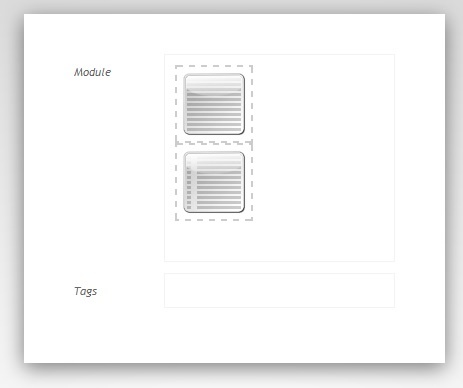
A page built with this template as it first appears.
Normally you would use a Highlight Template page as a handy bridge page leading to a richer source of content. You are essentially building a teaser, with an automatic link to that other page. This page was developed to work well in our carousel and slide deck components.
Navigate to your shared content area (e.g. /content/shared/www/your-site/) and click New, then select this template.
The page you create will appear with two stacked components and a bottom area that displays any tags that have been associated with the page.
Important Notice for Shared Content Templates
In order for any piece of shared content to function properly, there should not be any blank elements or incomplete links in the page (i.e., a photo component without a photo in it or an incorrect link).
No Additional Components Needed
Do not be alarmed if the Sidekick looks empty. This page does not allow any additional components to be added.
Highlight Component
The stacked components are very similar to the Sidebar Flex Module.
Highlight Tab
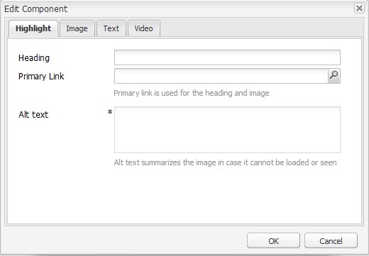
The page's Highlight Component, opened for editing.
Heading - Enter a descriptive title for the page that will be displayed in its published teaser.
Primary Link - Add a URL that will be applied to the heading and image.
Alt Text - Add a description of the image for users who may have difficulty seeing it. (Alt text is required by New York State policy for most images.) See webaim.org for tips on writing alt text.
Alt Text is generally required under state and federal accessibility laws. Read more about Alternative Text.
Image Tab
This will show in the published teaser for this page.
- Add an image by dragging one from the Assets Browser onto the component.
- Another way to add an image is to click within the empty Image tab and then upload an image from your computer. (Your image will not be stored in the Digital Assets Manager if you choose this method.)
- While basic image crop and rotation tools are available within the component, for best results use an external image editor such as Adobe Photoshop prior to upload.
- Recommended ratio for images is 418 pixels x 262 pixels. (Often the final rendering will be 209 x 131.)
- If you embed a video, you can also embed an image, which will then act as the 'freeze frame' starting image in the module. (A 'start' button will automatically be displayed overlying the image.)
Adaptive Crop
The image allows for use of the Adaptive Crop tool.
- Adaptive Crop is applied to your original image after any Image Size changes.
- These modifications override any changes previously made with the main Crop tool. You will be asked 'Would you like to override the native crop and use the adaptive crop?' Click Override to get started.
- Flexible Height is applied to your desktop image after Adaptive Crop adjustments and has no impact on mobile or teaser images.

Adaptive Crop settings in a Photo component.
The tool approximates how your original image will be cropped for desktop, mobile and teaser (thumbnail) views, allowing adjustments to better represent your desired focus in these contexts.
The interface responds to the main Image Size setting. Set the Image Size, then drag the Adaptive Crop cross-hairs to the center of your desired focus, and adjust the three sliders as desired to highlight the three zones.
The interface approximates the final displays. After you make your adjustments, we suggest you preview the results (e.g. using the mobile device emulator). And if you realize the List thumbnail is not working out as desired, consider also loading an image into page Properties that is cropped exactly as desired, where it will be used preferentially for teasers.
Text Tab
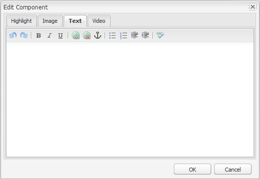
The Highlight Component's text tab.
It includes a Rich Text Editor that supports basic formatting (bold, italics and bullets) as well as hyperlinks.
Pre-formatted text can be pasted in from other sources (e.g. a word processor). This allows inclusion of additional text formatting such as sub- and super-script, but any incompatibly formatted text will be suppressed (e.g. titles or images).
Video Tab
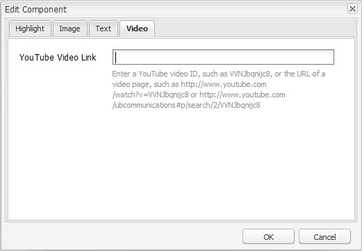
The Highlight Component's video tab.
Add the URL for a YouTube video.
- Please note, the thumbnail for this video will NOT be shown in the published teaser for this page. As a workaround, create your own thumbnail and include it in the Image tab.
List Builder Component
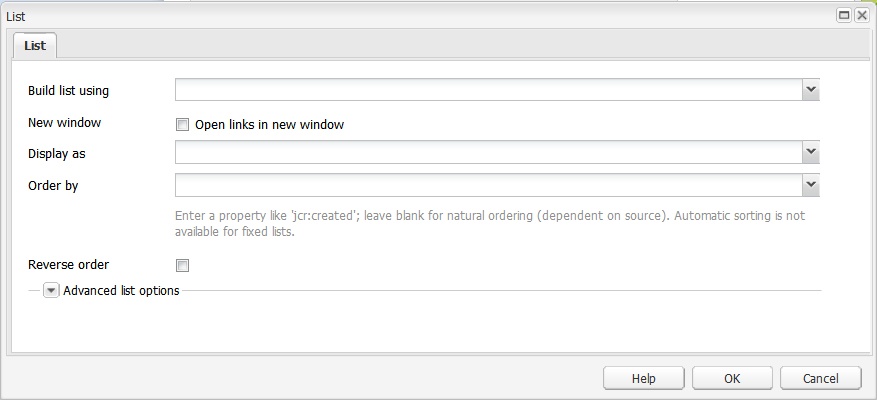
The component opened for editing showing the initial List tab settings.
This second component is the standard List Builder.
Here you will choose the type of list, as well as additional advanced settings.
Build list using: This drop-down menu asks how you want to build your list. You have the option to build it using:
- Curated list: Build a list with selected choices. Requires you to manually add pages to the list (and maintain).
- A Curated List tab will automatically appear. Click the magnifying glass icons to select Web pages to be displayed.
- Use the Up and Down buttons to specify the order that the web pages will be displayed in the list. The minus (-) buttons allow you to delete web pages while the + button enables you to add Web pages.
- Child pages: Populate the content of the list with the pages found in a segment of a website.
- A Child Pages tab will automatically appear. Click the magnifying glass icon to the right of the Parent Page field to select a folder from which to display pages in your list. (If you build your list with child pages you do not have the option of displaying them in the order of your choice.)
- Lists built by child pages can show their references in their natural order from the file tree (e.g. Order by {blank} and Order by cq:template).
- Tags: Build a list using the tag words assigned to certain pages. (Read more about Tagging Your Shared Content.)
- A Tags tab will automatically appear. In the Tags field, type the tags you would like to use or select the tags from a drop-down menu by clicking on the downward arrow sign to the right of the field.
- In the Limit to path field, choose the scope of the list by selecting the page, and subsequent child pages, to which you wish to limit the list. Leave this field blank to populate the list using the content of your entire UBCMS. Web pages with tags matching your selections will then be displayed in your list.
- Be advised, items in lists built using tags are not sorted in the normal default order even if they all originate in one folder. If you want the items to appear in a specific order, specify that in the Order by field.
- Tagged pages can also be listed using the Search option, which allows more advanced control. See Tips for building a list 'Build by Search' query.)
- Lists built by tags cannot show their references in their natural order from the file tree (e.g. Order by {blank} and Order by cq:template).
- A Tags tab will automatically appear. In the Tags field, type the tags you would like to use or select the tags from a drop-down menu by clicking on the downward arrow sign to the right of the field.
Do not link to DAM assets using a relative path (/content/dam/...). For these you must use a File Download component. > read more about this Known Issue: Having Trouble Linking Downloadable Files in the DAM
- Search: Use a particular word or phrase to build a list. Any page that contains the searched-for term will be included in the list. Meta-data including tags can also be found in this way -- read more about searching for tagged pages.
- Search query: Enter a predetermined unique keyword or phrase; e.g. "ubgreen-event" in our example.
This is optional, but with no keyword you will display ALL events in the calendar. More complex queries are possible. (See Tips for building a list 'Build by Search' query.) - Start in: Click the magnifying glass icon to choose where to focus the search. Child pages but not the selected parent will be included. Leave blank to use the current page.
- Lists built by search cannot show their references in their natural order from the file tree (e.g. Order by {blank} and Order by cq:template).
- Search query: Enter a predetermined unique keyword or phrase; e.g. "ubgreen-event" in our example.
- Another list: Populate your list using another previously created list. This is useful if you want to exactly mirror items displayed on another page, while perhaps limiting the amount of items displayed or changing other display settings.
- An Another List tab will automatically appear.
- A chooser is provided to select the page from which to pull your list, but currently does not allow you to select the actual list. Contact the DCT Help Team if you need assistance establishing the full reference path.
- An Another List tab will automatically appear.
- Advanced search: Do not choose Advanced Search unless you are familiar with writing queries. Build a list using Java API and REST API. Advanced search accepts a query description, and creates and runs an XPath query.
- An Advanced Search tab will automatically appear.
- If desired, the XPath query will filter the result set and extract facets.
- Query descriptions are made up from a set of predicates.
- For each predicate type, there is an evaluator component that handles that specific predicate for XPath, filtering and facet extraction.
- The REST API provides access to these features through HTTP with responses sent in JSON.
- Lists built by advanced search cannot show their references in their natural order from the file tree (e.g. Order by {blank} and Order by cq:template).
- An Advanced Search tab will automatically appear.
New window: Select so each clicked page is displayed in a new browser tab. When selected, an additional icon will follow the linked text on your published page, to alert visitors they are about to be taken to a new browser tab, and possibly leave the current website.
Note: For accessibility reasons, be careful about sending your visitor to a new tab. This behavior may be unexpected and disorienting. (> Learn more about link accessibility.)
'Open links in new window' and 'Display as: Full content' are incompatible and will disable each other when selected.
Link Label Icons
When New Window is selected, an additional icon will follow the linked text, to alert visitors that they will be taken to a new browser window, or even leave the current website.
And if the hyperlink goes to a downloadable file, an document icon will instead be shown as well as the file size if the file is on the same server. (Read more about link labels.)
Display as: This drop-down menu asks how you would like your list to be displayed. Lists fall into the general categories of Links, Teasers and Content:
- Links - Display the pages in the list as underlined links. Clicking on one of the links will redirect the user to the page selected. The types of links available are:
- Plain (default): If no other option is selected, the list will automatically be displayed as a set of plain links. They are bulleted with the right angle bracket (>) symbol.
- Medium Call to Action: The links are bulleted with the Call to Action component’s circular, exclamatory icon (medium size).
- Large Call to Action: The links are bulleted with the Call to Action component’s circular, exclamatory icon (large size).
- Compact: The links are shown in a simple comma-separated list.
- Grouped by Date: The un-bulleted list will be displayed with emphasis on the separate entries' time of creation. The date appears as the heading for each entry while the exact time of the page's creation and the link to the page are placed beneath.
- Grouped by Title: Links are grouped alphabetically by the first letter of their titles and that letter precedes each group; e.g.
T
> Terminator
> Trains, Planes and Automobiles
- News (with dates): This option also displays an un-bulleted list with the date of creation. A simpler format than Links: Grouped by Date, the title of each entry is followed by the date of creation all on a single line.
- Teasers - Display a preview of the information that's on the pages from your list. The types of teasers available are:
- With Images: Instead of bullets, an image from each page appears to the left of the page’s title. The introductory text of each page is displayed beneath the title. (If no image is available, space will be left to ensure all teasers stay aligned.)
- Without Images: Displays the title of the page with its introductory paragraph. Items are bulleted with the Call to Action component’s circular, exclamatory icon (large size).
- With Dates: Instead of bullets, an image from each page appears to the left of each page’s title and its date of creation. The page’s introductory paragraph appears below.
- Grid: Displays the list as a gallery of images. Each page is represented by an image with its name beneath the picture as the link.
- Directory (with interests): Meant to be used with the Faculty Profile Template, it reveals each person's name, contact details, titles, and research interests.
- With Images: Instead of bullets, an image from each page appears to the left of the page’s title. The introductory text of each page is displayed beneath the title. (If no image is available, space will be left to ensure all teasers stay aligned.)
- Content:
- Full Content Displays the full content of each page in the list.
'Display as: Full content' and 'Open links in new window' are incompatible and will disable each other when selected.
Order by: Here are some of the ways in which you can order your list. Not all appear in the dropdown. Others may be available on request -- contact the DCT Help Team for details.
Note: Generally it is best to provide a value for this setting. When left blank, the results will obey the natural arrangement of the pages in their parent folder(s), but if the list is set up as a search or advanced search query, results will display by search relevance, and if the list is built by tags, the display order will be unpredictable.
- cq:lastModified: Results displayed chronologically by page last modification date, with the page most recently edited on top.
- cq:template: The order will be established according to its arrangement in the Page Tree, sorted by template type used on each page. (This natural order is not compatible with lists built by tags, search, or advanced search.)
- jcr:created: Results displayed chronologically by page creation date, with the earliest created page on top. The results can be confusing because the order in Author will often not match that on the live site. The order of live pages is by first activation date, not original creation date in Author. Subsequent reactivations have no impact, but a page that is deactivated and then reactivated will receive that latest activation date.
- jcr:path: Results displayed alphabetically by each page's full path in the UBCMS (/content/www/abs/page-name). For pages all in the same folder, it effectively alphabetizes by page name.
- jcr:title: Results displayed alphabetically by page title.
- navTitle: Results displayed alphabetically by each page's Navigation Title (as set in Page Properties).
- postDate: Results displayed chronologically. For News Article Template pages, this will be by date created. For pages created with other templates, each page must have a Date Created component. If not all pages have a compatible date, the display order will be unpredictable.
- random: Each time someone views the page, the displayed items will be shuffled. (Learn how the UBCMS handles random.)
Note to developers: some additional attributes are available on Author but not your live pages, so cannot be used, e.g. lastReplicated.
Reverse order - Check the box to select whether you would like to inverse the order selected in the Order by field.
What is random?
Using server caching, 'random' content is shuffled to appear fresh for each visitor, but the entire original content collection is not redrawn each time it is presented. Instead, the server randomly pulls a sample of the original content after each cache refresh, and then shuffles that sample for your visitors. If you need to show the entire collection, take advantage of the 'show all' feature when it is available, and if your business needs require a truly random reassortment, please contact the DCT Help Team.
Start at: Select how many items you would like to skip at the beginning of the list (example: '5' will skip the first four items and begin the list at the fifth item). Left blank, the default value of '1' will result in the list displaying every item in your list. This setting can be useful if you wish to feature several items in one group, perhaps at the top of your news page, or on your homepage, and NOT have them repeated with the rest of your list displayed elsewhere on your site.
Limit: Choose a maximum number of entries (optional).
- If left blank, the default value is 100; for example, if you leave it blank, no more than 100 items will be available.
- Use a negative number to exclude items from the end of the series
- If you set the Limit value smaller than the Paginate after value, users will never see the next page navigation!
If you want all items to appear in the list, do not leave the Limit field blank. Instead, enter a value that you anticipate will meet your needs; for example, 200, 500, etc. (The News Center has used 9999 as a 'very large number' because their archives date to 1990.)
Mobile limit: Maximum number of items to be displayed on a small screen device.
- Leave blank to use the same limit as desktop.
- Not compatible with pagination.
Paginate after: This setting turns on paginated returns, with the maximum number chosen displayed for each page (optional).
- If left blank, the page will display all entries in the list.
- If defined, a button labeled Next will appear at the bottom of the list on the first page. The subsequent pages will also include a Previous button until the final page of entries.
Exclude current page: Do not display any entries that link to the page on which the list is shown (optional).
Enable scheduling: Select to enable shared content Scheduling.
- Scheduling can be used to automatically change the content in a list over time.
- When scheduling is enabled, only pages whose “Featured on/off time” (as set in each page’s Page Properties) will be shown in the list.
- Scheduled lists can be previewed for a given date and time by right-clicking the list and choosing “Schedule Preview”.
- Unlike Delayed Activation or Scheduled On/Off Time, Featured On/Off Time does not affect the page’s visibility elsewhere on the site; it is still visible in navigation or by direct link.
- Pages with “Featured on/off time” set must also be activated.
- Examples of uses for list scheduling:
- Hide an application link after a deadline has passed.
- Switch from one featured image to another in a slideshow each day (set the start time of one item to the end time of another).
Host page: Specify on what page of your site you would like any shared content shown. By default will be the current page.
Empty message: Choose a suitable message that will display if the list is currently empty. (In the example shown above, it will say "Sorry, there is no news today.")

The opened for editing showing the initial List tab's advanced settings.