Writing for the Web
Online readers scan pages instead of reading every word (see Jakob Nielsen How Users Read on the Web). This guide will give you quick access to standards and formats to help you write successful and consistently readable content.
We ask you to generally follow AP Style guidelines, but to ensure consistency across all our sites, UB has developed some general editorial style guidelines that reflect our new brand. Read about the guidelines in the UB Style Guide.
On this page:
Write for ”Scan-ability”
Writing for the Web is about making your writing easier to read and use, not dumbing down your ideas. Help readers by writing for on-screen reading:
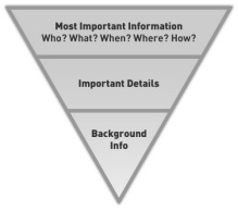
- Write in the journalistic “inverted pyramid” style by stating your most important ideas and UB brand-related elements first (see below).
- Use meaningful subheads to help readers find the content they want.
- Highlight key phrases and words to draw visitors’ attention.
- Use links to provide easy access to background information and (again) highlight key phrases and words.
- Use one idea per paragraph. As in newspapers, one-sentence paragraphs are perfectly legitimate on the Web.
- Avoid acronyms and abbreviations. If you must use an acronym, handle it as you would on paper: Spell it out in the first usage on each page and then use the abbreviation thereafter.
- Use bulleted lists to pull out key ideas.
Place Critical Content at the Top
Inverted Pyramid Style of Writing
Make sure the content you especially want your visitors to see is visible without scrolling.
Visitors will scroll, especially if they can tell there’s content that interests them lower on the page. It’s still a good idea to ensure that the first thing they see is the content you most want them to see!
Check how you organize your content and think about the proportions of each piece. A well-chosen image can convey your department’s unique character in an appealing way. However, placing a large picture at the top of your page hides your other content, making it less likely that users will scroll down to see it.
Authentic Voice and Tone
Authentic voice sounds true and genuine, the way we speak in a conversation. Readers pay attention and listen to writing that sounds like a person is talking. Use inviting and professional language. Write to your readers in the second-person narrative: Address your audience directly, using “you” and “your.”
Example: “Your research project, designed in conjunction with your faculty mentor, will match your interests and abilities with the needs of the research group. In our program, you will work on a project that interests you.”
Be Formal When It Matters, Otherwise Relax the Rules
Please adhere to the UB Brand writing tips where they apply to formal names of offices, programs and titles. This will ensure clarity and consistency across the visitor's experience with any of our websites, which you will recall is one of the basic tenets in the DCT process.
We also encourage use of proper grammar as a general practice; however, some rules that are often sacrosanct in formal print publications may merit more leniency for online users, provided it is for a good reason. Some examples include:
- sentence fragments are permissible when they allow brevity; for example, in headings like "About Us"
- use numerals even for whole numbers less than 10
- paragraphs can be as short as one sentence
For more, please read Jakob Nielsen's short article, Break Grammar Rules on Websites for Clarity.
Tips on Rewriting Content
The content you produce for a print publication is not always ideal for the Web. Rewriting can be well worth the time it takes. Context will determine how much rewriting you need to do. For example, articles from an alumni magazine that need to be posted on the magazine’s website do not need to be rewritten. However, they probably could benefit from packaging that optimizes the platform, e.g. includes such things as multimedia, pull quotes, subheads, related links and more images than you might have had “space” for in the printed material.
Keep It Short
On the Web, concise is generally better. Use short paragraphs and pick short words. Using “about” instead of “approximately” or “use” instead of “utilize” can improve readability. Cutting unneeded words also helps.
Example:
Before: “The Department of Biology has already seen its enrollment grow by an incredible 10 percent in the past three years.”
After: “The biology department has seen enrollment grow by 10 percent in three years.”
Consider Our International Audiences
Our university is of great interest to people for whom English is not their first language, and who may not immediately (or ever) understand some of the nuances of our colloquialisms and jargon. Sometimes even quite common phrasings may be confusing or even alarming to them. Our Solutions Group on Sept. 8, 2016 provided some excellent details about this pitfall (15 minutes).

