Transforming UB’s digital communications.
Site Header
Your header introduces the architecture of your site empowering your user for a successful journey though your site.
Consult with your Unit Web Leader before organizing and planning your header.
On This Page:
Before setting your header, carefully consider its purpose. Whether you use basic navigation or the enhanced options, architecture is the key to your site's success.
Reviewed February 11, 2025
Overview
Each UBCMS site has a unique header displayed atop every page. Done right, your header introduces the architecture of your site to your users, empowering them on a successful journey though your pages.
Before setting your header you need to carefully consider its purpose, and your ability to steward. Whether you use basic navigation (which we encourage for most sites) or one of the enhanced menu options, your architecture is the key to your site's success.
Solutions Group Presentations
In Author, the header is specified at the top of your home page by an 'Inherited Paragraph Reference' (like a Shared Content Reference), and then automatically inherited to all of your site's pages.
Specialists then manage the actual header content by editing an actual header page in your site-wide configuration folder (e.g. /content/www/abc/config).
Your header is automatically displayed in the Author environment, but must be published to show on your live pages, and republished after any changes.
Please make changes carefully as they are reflected throughout your site.
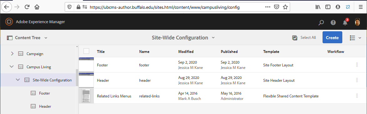
Site-Wide Configuration folder
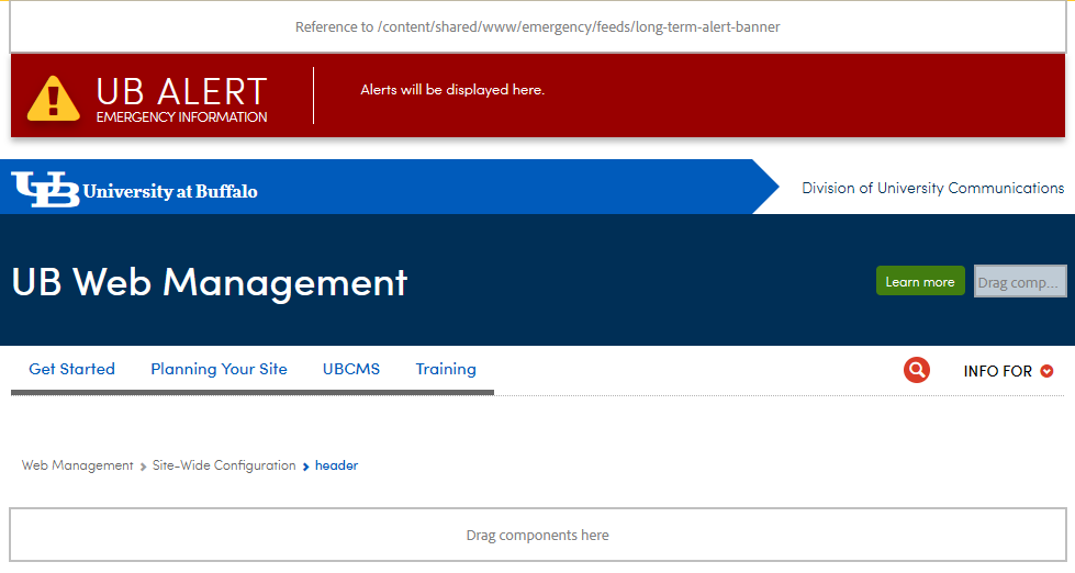
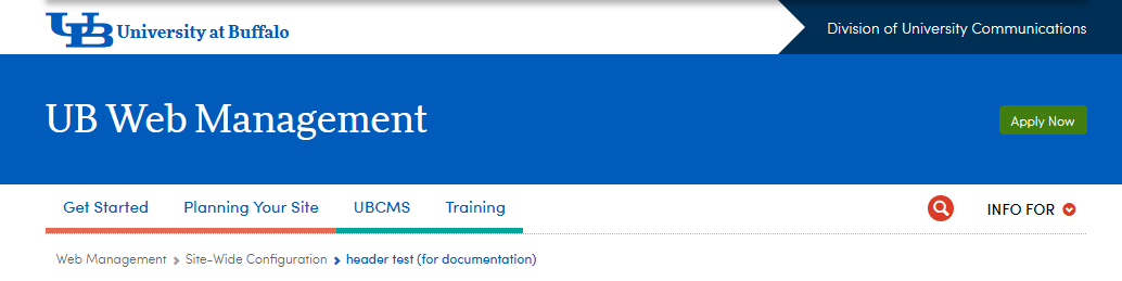
Enriched headers come with Emergency Alert and Issues Advisory banners, the main brand lockup, breadcrumbs, and top navigation. The UB logo and university name in your lockup are pre-linked to the UB homepage.
Enriched headers act as 'sticky' nav, so a slimmed down but full-featured version of your top navigational glides down the page as a visitor scrolls on large or small screen devices. To see this effect in Author, switch to View as Published.
Initially, every header will need some adjustments to be appropriate for your site, such as adding your unit's formal name and a primary link back to your home page, plus there are some branding choices. There are further considerations such as site-wide search, optional key tasking buttons, and audience page links which are described further below.
A new header can be created at any time, as an experiment to redesign your site, or as part of a planned transition to new header style or architecture.
- Multiple headers can coexist in Author. Your home page designates which is in use at any time as set in the topmost reference on the page.
- Multiple headers can be published without negative impact, provided you pay attention to which is currently referenced by your pages.
- You can also assign an alternate header to a test page and then use the View as Published feature to compare it with your primary header.
Put these in the footer:
- link to a Contact Us form
- link to an Intranet
- social media buttons
- link to a site map (for SEO and mobile findability)
- unit lockups and contact information
Brand Considerations (logo, name, lockup)
Your website's header supports UB's brand by including a trademarked lockup with the UB logo and university name, which are pre-linked to the UB homepage, plus your unit's formal name, as established by the university.
Only official university logos or marks are displayed in a site header. If you wish to acknowledge a formal relationship with an external agency, their logo, along with a suitable positioning statement (e.g. “co-sponsored by” or “a member of…”), may be shown in the body of your website or in the footer.
Create a Header Page
Websites are created with a header page, which only Specialists can modify.
- In the Sites Console, switch to your site-wide configuration folder (e.g. /content/www/abc/config).
- Create a new page, and choose the Enriched Header Page template.
- For Title and Name, we suggest an intuitive label; e.g. 'header-new'. Later when this becomes your new primary header, unpublish and delete your old header and retitle and rename the new one as the current "header".
- For convenience, we suggest setting the Preview Column Width to 12 (full page width).
Only Specialists can modify header or footer pages.
> Learn more about UBCMS roles.
Set Up the Enriched Header
Within the enriched header page is an Enriched Header component.
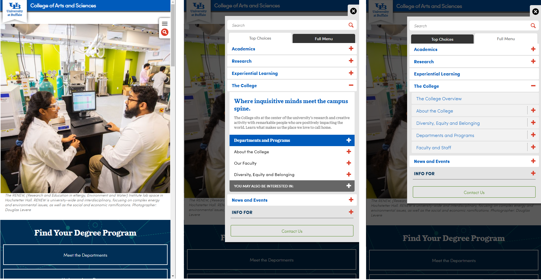
The Enriched Header component is divided into a main 'Enriched Header' area, then at the far right, Search, Audience Navigation ('audiencenav') and a place to add Buttons for key tasks. Across the bottom is the Enriched Top Navigation area.
The header page opened to reveal the different activity areas.
Master Class
Enriched Header Sections
Enriched Header area
Header tab
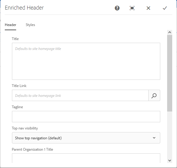
Enriched Header main settings.
Some are not available depending on the Level selected in the Styles tab.
- Title - The formal branded name for your unit. Leave blank to display your homepage's title.
- Title Link - Location of your site in Author (e.g. /content/www/abc or content/abc). Leave blank to link automatically to your homepage.
- Tagline - An optional phrase to reinforce your strategic vision.
- SUNY Modifier - Primary Level sites can control whether 'The State University of New York' is included in the brand lockup.* This setting is not visible to oother levels.
- 'Include SUNY modifier (default)'
- 'No Modifier' - Hides this designation.
- Top nav visibility - Sites that rely on left navigation, or single page sites may opt to hide the top navigation.
- Parent Organization title and link(s) - Secondary Level sites can indicate direct reporting relationships to one or two parent units and their websites.
* The simpler UB lockup (without SUNY Modifier) is best for internally focused sites, while the 'SUNY Modifier' version (the UB lockup supported with 'State University of New York') is best for sites that have external or hybrid audiences.
Long titles can wrap on to a second line. To control where that break occurs, use a return in the field ('Enter' key).
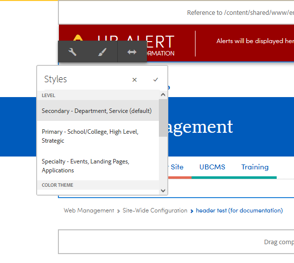
Styles tab
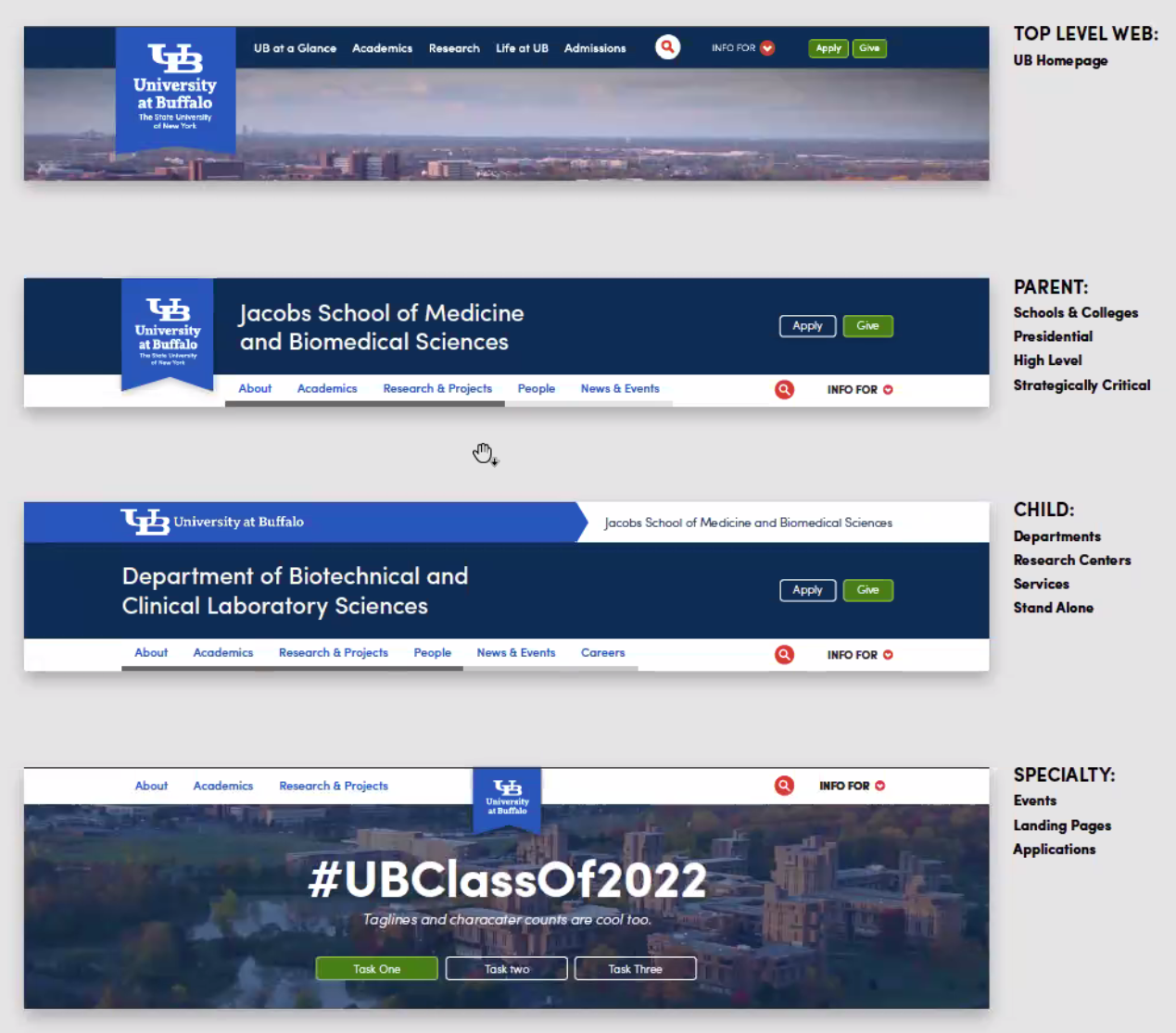
Examples of the header level types.
- Level (required) - Choose from:
- Primary - School, College, High Level, Strategic
e.g. School of Engineering and Applied Sciences; Office of the Provost - Secondary - Department, Service
e.g. Department of Geography; the Brand Site
- Specialty - Events, Landing pages, Applications
e.g. Commencement; Homecoming
- Primary - School, College, High Level, Strategic

Choose dark blue, blue or white.
- Color Theme - Choose from these UB-branded hues:
- Dark Blue (default)
- Blue
- White

Sans-serif Sofia (top) vs Serif More.
- Title Font - Choose from these type faces:
- Sans-serif Sofia (default)
- Serif More
Note: the font size adjusts automatically to the length of your title.
- Sans-serif Sofia (default)
Power User Shortcut
Use the paintbrush icon on the Enriched Navigation component toolbar to quickly adjust the Styles settings (Level, Color Theme and Title Font).
The paintbrush icon shortcut quickly opens the Styles settings.
Key Task Navigation (Buttons)
Buttons for key tasking.
Button components can be added to this layout container to support your key tasks and top conversions (e.g. apply, give, sign up, or register).
- This area should highlight the 1 or 2 most critical key tasks for your site.
- Use short, concise labels (e.g. "Apply" or "Give").
- Too many buttons or long labels will cause crowding and the buttons may wrap undesirably.
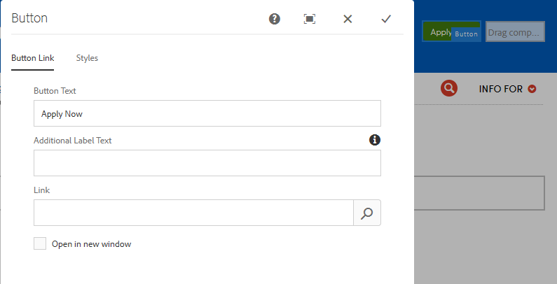
Button Link tab
- Button Text - Label the link; e.g. "Apply Now".
- Additional Label Text - (for accessibility *)
- Link - Add your target URL.
- Open in new window - Open the link in a new browser tab. Use cautiously. This can confuse visitors especially on small screen devices.
* Additional Label Text will not be visible, but will be read by a screen reader immediately after the visible label. Use this field to help make sure all link text is unique. Read more about making links accessible.
Button Styles tab
- Color - Choose between
- Primary default (green)
- Secondary (transparent with a white outline).
- Primary default (green)
On small screen devices, these buttons will shift into the menu tab that slides out from the right.
Top Navigation area
Top Navigation area.
This is where your primary navigation is housed that visitors will use to guide their journey through your site. It becomes 'sticky' and glides down the page as your visitors scroll.
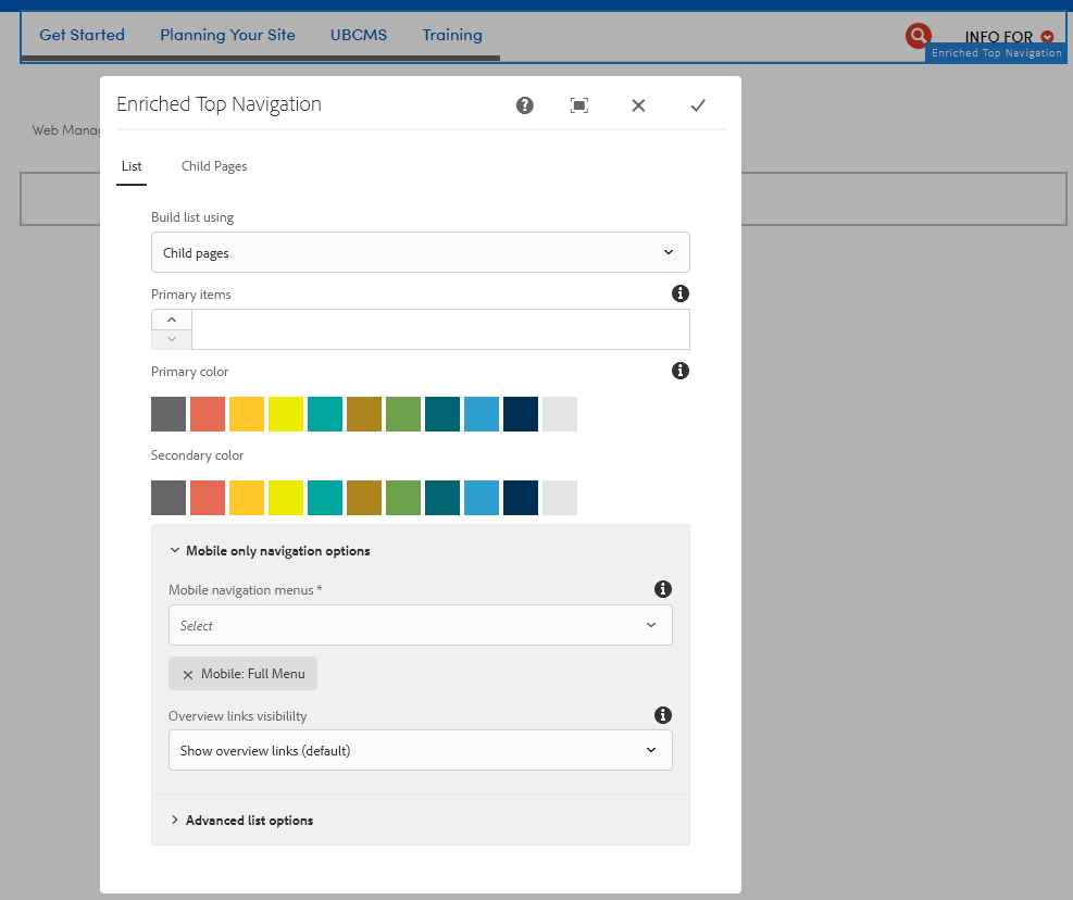
By default, this feature auto-loads a tabbed navigation that displays your site's actual folder tree structure in the UBCMS. For a simple site, you can apply this default navigation; e.g. by using children of your homepage. For enriched navigation, you will instead be referencing a series of menu pages built using Navigation Menu Templates.
Note: 80% of sites just need the basic/default navigation, and one-page sites and those using sidebar navigation can hide it entirely.
- Build list using - Loads a corresponding secondary tab where you define the navigation. Choose from:
- Child Pages - By default, this applies your homepage, so all secondary pages not set as Hide in Top Navigation are displayed as your top navigation.
- Curated - Specify each navigation member manually.
Site navigation. The first two primary tabs are red. The third and fourth are secondary, in teal.
- Primary Items - Applies the primary color to a specified number of tabs, counted from left to right. The default makes all tabs the primary color.
- Primary Color - Optionally choose a specific color to mark the navigation tabs. The default is gray for desktop and none for mobile. When chosen, the primary color is shown for all mobile tabs.
- Secondary Color - Optionally choose a hue to differentiate a second set of tabs The default is gray for desktop and is ignored for mobile.
The tab colors can be used to visually designate a collection of like tasking areas.
Navigation does not 'stick' in Edit Mode
The 'sticky' function is turned off in Edit mode, which means it stays up top as you scroll down the page. To see it in action, switch to View as Published or view it on your live site.
- Mobile navigation menus (only influence mobile users)
- Top Choices - Displays the curated menu tabs corresponding to the top navigation shown on desktop browsers. Not normally selected on its own, since visitors may be mislead because they will not see all pages of the site.
- Full Menu - Displays a traditional style navigation tree using the actual UBCMS folder structure. Includes all pages on your site that are not set as Hide in Top Nav.
- Overview links visibility - Conceals the the topmost links in navigation, e.g. "About Us Overview". Mobile users see this extra link because the topmost navigational element instead controls the expand/collapse control. If your navigation is built using the basic collections of child pages, there will no longer be a link to your main secondary pages but enriched navigation sites may not have overview pages. Choose from:
- Show overview links (default)
- Hide overview links
The College of Arts & Sciences website top navigation in desktop (left) and mobile views.
Site-Wide Search
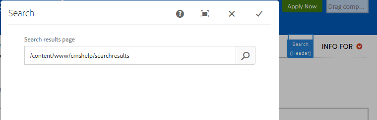
Site-wide search is a common addition to large or complex sites and requires an additional page in your main site folder.
- If your site does not yet have a Search Results page, ask the DCT Help Team.
- Once you have a Search Results page, modify the Search area in the Enriched Header component to reference that page; e.g. /content/www/abc/searchresults. (You will now see a search box in your header.)
- Then modify your Search Results page by tailoring its Search component to meet your strategic needs, e.g. the search is often limited to just your site.
If the search and audience navigation task areas are not 'hot' (cannot be modified), try refreshing your page or even a full refresh (Shift + refresh).
Audience Navigation area
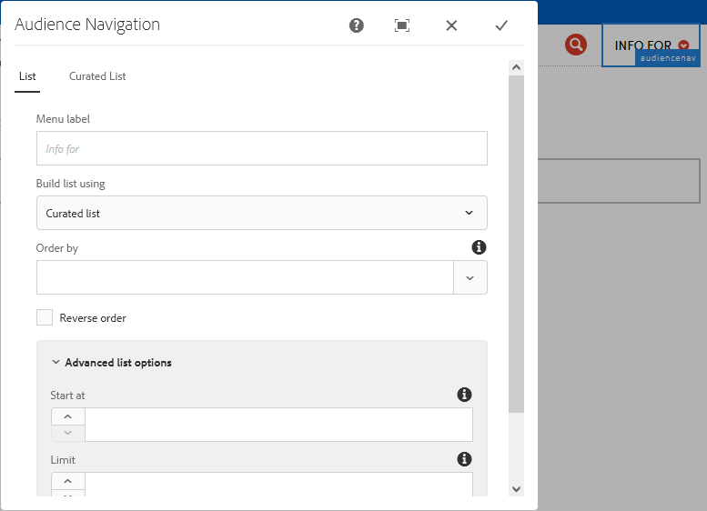
Audience nav area.
A visible but restrained zone for 'info for' audience tasking or 'info about' resources, these links should be singularly focused and not mixed-and-matched. When populated, this section becomes a simple dropdown list of links.
The most commonly used settings are:
- Menu label - By default, the dropdown will be labeled "Info for" (intended audiences) but that can be tailored to your needs, e.g. 'Info for... current students'.
- Build list using - Normally you will choose Curated and reference the specific pages on the second tab. But these can be built using tags or child pages.
NB. You could link to your Intranet here, as an internal audience target, but the ideal place for the intranet is in your footer.
Best Practices
Minimize what navigation you present to keep it scannable and prevent informational overload.
- Organize intuitively for your audience(s).
- Use clear labels and avoid confusing jargon.
- Your navigation is a wayfinding guide, not a site map or more Web pages.
- Limit your main navigation to nine elements (Top Nav + Search + Audience Nav) or less if your character counts are long.
- No more than two Key Task Nav (buttons)--one primary and one secondary--in addition to the 9 overall limit.
- Be careful not to have too many tabs or overly long headings in your top navigation. Generally five-six tabs (folders) and 80 characters is safe to prevent running off the side of the page or being hidden by other tools like your site-wide search.
- Use the SUNY Modifier setting to add 'State University of New York' to sites that have a hybrid or external audience. By default it is turned off, for internally-facing sites.
Enriched Top Navigation (if needed)
For the 20% that need more than the basic/default navigation, Enriched Top Navigation supports content-rich tabs with additional text, images, modules, news and event feeds, and multi-column lists of links. These tabs are created using special pages built with a variety of Navigation Menu Templates.
80% of sites will fill their needs with the basic/default setup and no enhanced menus. Some others may benefit from an enhanced tab, but the rest can still be Basic tabs.
Customization (developers only)
The UB brand must be consistently applied to all university properties and exceptions must be negotiated carefully. Please see the Brand Site for more details.
However, developers may wish to explore adding custom code to their website, such as using an HTML Snippet to tweak the CSS or to add additional Google Analytics. Placing this code on a header or footer page will then apply it to every page in the site.
Please proceed with great caution and contact the DCT Help Desk if you are considering a custom header.
Be forewarned, custom code:
- can significantly impact page performance.
- may interfere with the function of your pages.
- may create accessibility issues.
- must be maintained by your unit (for every code deployment and upgrade).
To work correctly, Google Analytics can be placed in an HTML Snippet on the header (or footer), or in the Properties of your site's home page, but NOT in the header/footer Properties.
Accessibility concerns for customizations
Authors are responsible for any custom adjustments they make to their UBCMS pages. This includes code added using External Embed or HTML Snippet components, or introduced through page Properties.
Best practice: only a developer should modify the standard UBCMS code or styling, and any adjustments should be made thoughtfully, with regard for accessibility and long term maintenance.
Authors are responsible for any third party content that is hosted or linked from their UBCMS pages.
This includes applications such as Formstack forms and Google Maps, that are displayed using their own component, as well as entries from UB's Calendar of Events, and external content hosted using HTML Snippet or External Embed.
Best practice: for Formstack forms, avoid using the date picker and the 'other' option in dropdowns.
Best practice: for the HTML Snippet and External Embed, always run an accessibility test (e.g. using a browser extension), check its behavior in mobile, and consider how it may impact page performance in general.
Best practice: if your code relies on a 'div' or iframe to house its content on your page, it must have an identifying label, often coded as a 'aria-label' or sometimes a 'title', that assistive technology can see. Formstack produces a title automatically, although it is poorly worded, but other applications tend to skip this requirement so it must be added manually on your end.
If you have concerns that external vendor content is not accessible, please contact UB's Web Accessibility officer.
Additional Reference:
Refine and Test
Once your header is built out, it should perform equally well in desktop and mobile views using the UBCMS' built-in emulator tool.
At a minimum, make sure:
- The navigation is correct.
- None of the elements wrap or overlap.
- It looks and functions equally well in desktop and mobile.
Keep your old header page for a week or two in case you unexpectedly need to revert back to it.
Stewardship Concerns
By the time you have set up your enriched header, you should already have a stewardship plan in place.
- Set up stewardship reminders to review at least yearly.
- Establish parameters for regular assessment of site usage (analytics).