Enriched Top Navigation
The deadline to migrate to the new site header is December, 2024.
On This Page:
Reviewed September 27, 2023
80% of our sites just need the basic/default navigation. But if you feel your site's Business Strategy would benefit from a more enriched navigation:
- Check in with your Unit Web Leader.
- Evaluate your site's needs.
- Proceed carefully.
Overview
Stepping beyond the default links to your site's secondary pages, enriched headers support content-rich tabs with additional text, images, modules, news and event feeds, and multi-column link clusters. Each of these enriched tabs displays a dedicated mini-page built with one of the suite of Navigation Menu Templates.
Create these Navigation Menu pages directly beneath your header page so they are easier to steward and it is simple to reference them from the header's top navigation. In turn, as desired, you can then create additional elements (e.g. a Related Links page) as a child of any of the main Navigation Menu pages.
These special Templates load with an initial list component and one or more column controls but support many components, including Photo, Intro Text, Body Text, List Builder, and Event List.
Note: the Navigation Menu page title will show in the main site navigation unless overridden in the main Header page (where that Navigation Menu page is referenced).
Less is more: enriched tabs are not Web pages or a site index.
Organize intuitively and strategically.
Before You Begin
Consult with your Unit Web Leader then review your existing site with fresh eyes. The Master Class resources below are invaluable for this process.
- Ensure your business strategy is up to date *, includes key messages, prioritizes target audiences, and defines key tasks for each audience.
- Review your business cases.
- Review your current IA.
- Review your site utilization (analytics).
- Be mindful of your resources (skills and available time) for buildout.
- Plan now for active stewardship.
* If you need a copy of your previous business strategy, contact the DCT Help Team.
Master Classes
For Unit Web Leaders, evaluations for what navigational structures are most appropriate for your portfolio are available. Contact the DCT Help Team.
Identify the appropriate navigation menu for each section of your site.
Each template was crafted for specific use cases -- see the table below.
- Identify messages and key attributes you will showcase.
- Build for mobile first.
- Keep it simple.
- Keep in mind this is not a Web page or site index.
- Build, assess, refine.
Which Menu Style Is Right for Our Site?
80% of sites will fill their needs with the default setup with no enhanced menus. Some others may benefit from an enhanced tab, but the rest of their tabs can be the Basic template.
The default navigation in the Enriched Header very effectively displays your site's internal architecture, based on the folder tree structure. This can be further customized by using 'build list using curated' instead of 'build list using child pages'.
For those few sites which need to enhance further, the Basic Menu pages produce a similar effect to the default navigation, but can be intermingled with the other menu types when those are necessary.
If you still wish to proceed with the rich templates, before you dive in, consider:
- This step requires IA expertise -- you need skilled resources to keep them focused and make your navigation effective and supportable. Work with your Unit Web Leader on this.
- Is your site more ”tell” or ”sell”..?
- Some templates are more informational ("tell").
- Some templates are geared towards marketing rich goals ("sell").
- Is your site a multi-function complex site like a school or does it have a more singular focus like an institute?
- And then for each section, match the templates to your specific needs.
- Also, what resources are available to create and steward your site? Don't bite off more than your team can chew -- keep it manageable.
| Low Complexity | High Complexity | |
|---|---|---|
| Low Proportion Marketing Content | • Default setup or Basic Menus | • Basic Menus • List Menus as needed |
| High Proportion Marketing Content | • Basic Menus plus others as appropriate | • Full array of Nav Menu choices |
Master Classes
DCT Solutions Group - April 21, 2023 - main presentation
DCT Solutions Group - April 21, 2023 - Pilot Sites
How to Create Navigation Menu Pages
Before you start to create menu pages, you should have already reviewed your site's information architecture. You will need the locations of the main secondary pages to apply to each menu page in your new navigation.
You will be building a menu page for each section (tab) of your top navigation and each menu page should correspond to a section in your site's information architecture plan.
You have the option to just build these tabs using the Basic template, which mimics the default top navigation style, but appreciate that the more enriched templates (Marketing, Information, etc.) support many additional features.
Menu page templates are only available in your site-wide configuration folder (e.g. /content/www/abc/config or /content/abc/config), but we suggest you actually create the menu pages as children of your header page, so they are collected together in one spot, and are thus easier to reference from your header as you build out or steward your top navigation. And if they are needed, create additional elements (e.g. a Related Links module) under the corresponding menu page.
When each menu page is created, the following settings are provided:
- Title - Enter a title that will make sense for this tab in your navigation. *
- Name - This becomes part of the URL path to your pages.
- Navigation Parent (Root) Page - The location of the corresponding section of your site; e.g. /content/www/abc/academics.
- Tags
* Note: Menu page titles will show in the main site navigation unless overridden in the main Header page (where each menu page is referenced).
Once the page is created, you will see one or more columns. Within each column is often a Navigation Section, which is a content container. Within each Section may be one or more Navigation Lists (essentially a List Builder component), and sometimes Intro, Body Text, or Photo components.
Some templates come with a section housing 'Related Links' or 'You may also be interested in' links. Work with the preloaded content, or thoughtfully add additional components as suggested below. The lists may be pre-populated with links based on the root path you chose, but you can then modify them to suit your needs.
Master Classes
Navigation Menu Template Types
Navigation Menu Template Summary
Template | Best For These Sites | Core Value |
|---|---|---|
| Basic | Standard sites that are not just using the default navigation. Should be the starting point for each site that uses enriched top navigation (most will just use these). |
|
| Lists | Complex sites with mostly informational content ("tell"). |
|
| Marketing | Complex sites that have a marketing focus ('sell'). |
|
| Informational | Complex sites that are a hybrid of marketing and informational. |
|
| Showcase Lists | Complex sites. |
|
| Showcase Gallery | Complex sites. |
|
| Transactional | Complex sites. |
|
| Related Content | Standard sites or directories. |
|
Template Details
- Each section describes elements specific to that menu template type.
- Then please see the Best Practices section below other considerations.
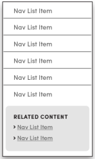
Skeletal view of the Basic Navigation Menu Template .
A simple list of links that reproduces the default form of the header architecture. 80% of our sites will use the default navigation, or switch to this template because of the CTA buttons.
Best for:
- Standard sites or directories
This template is created with:
- a Navigation List (usually your site's core content)
- a place to add a Related Content container
Key features:
- includes a column for links (can be several clusters)
- supports a 'call to action' button
- can include a Related Content menu page
If not fully populated, this will reveal white space across the rest of the navigation area. The other menus are all designed to be full page width.
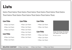
Skeletal view of the Lists Navigation Menu Template .
Gives more control (and features) than the curated lists in the default top navigation.
Best for:
- Complex sites with emphasis on information.
Key features:
- Supports curated link clusters
- Cluster headings can be linked or unlinked
- Can have several clusters in each column
- Can apply additional column controls
- Supports a sidebar highlight module with rich but focused messaging that can showcase shared content.
- Supports CTA button(s).
- Supports "You may also be interested in" links to cross-sell or link to related external services.
This template is created with:
- a Body Text module (upper left)
- four Navigation Section columns
- each Navigation Section holds a Navigation List
If appropriate, these components may be useful in fine-tuning your presentation:
- A Flex Module or Shared Content Reference can replace a Navigation List to display a module.
- An Event List can replace a Navigation List (event titles wrap - try to keep them short).
- A Callout can replace a Navigation List.
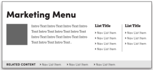
Skeletal view of the Marketing Navigation Menu Template .
Promote key features; e.g. About, Our School, Research.
Best for:
- Complex sites with heavy marketing needs.
This template is created with:
- an Image (Photo)
- Intro Text
- two Navigation Section columns
- each Navigation Section holds one Navigation List
- a "You may also be interested in" section with a Navigation List
Key features:
- Image-text rollover provides positioning with enriched messaging.
- Supports curated link clusters:
- Title provides key message for the target audience.
- Can set multiple (short) clusters in one column.
- Supports a CTA directly related to the rollover or link cluster, but be selective (for inspiration, see Adobe's menus).
- Supports "You may also be interested in" links to cross-sell or link to related external services.
Inspirational Examples:
- UB home page's UB at a Glance and Academics tabs
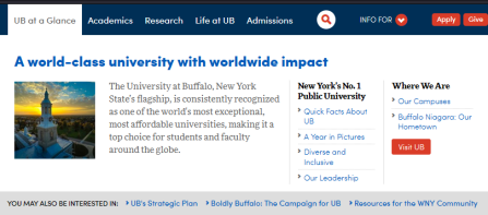
UB at a Glance menu.
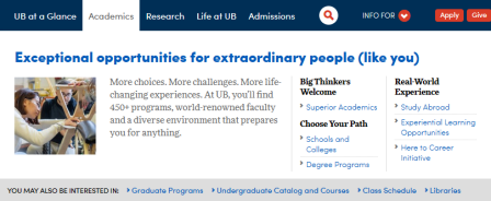
Academics menu.
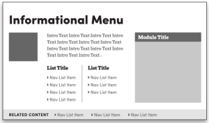
Skeletal view of the Informational Navigation Menu Template .
Hybrid of marketing and informational styles.
Best for:
- Complex sites with marketing AND information needs.
Key features:
- Each link cluster becomes a resources list, by identifying the audience(s) and using the link text to put a face on what is in it for them (scent).
- Supports a sidebar highlight module with rich but focused messaging that can showcase shared content.
- Supports "You may also be interested in" links to cross-sell or link to related external services.
This template is created with:
- a Title (H2 heading)
- an Image and Intro Text (upper left)
- two Navigation Sections
- each Navigation Section holds a Navigation List
- a 'Resources For' Menu Section module with Body Text (right side)
- a "You may also be interested in" section with a Navigation List
If appropriate, these components may be useful in fine-tuning your presentation:
- Add one or more Title subheadings with links to the 'Resources For' section.
Inspirational Examples:
- UB home page's Research tab
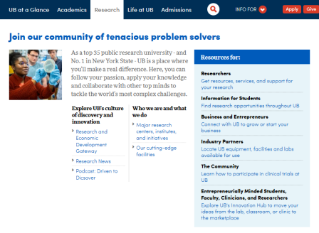
Research menu.
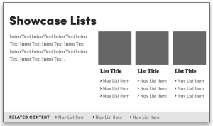
Skeletal view of the Showcase Lists Navigation Menu Template .
Strong visual presence reinforces each link cluster in a balanced presentation of images and related links; e.g. Life at UB, Diversity and Inclusion.
Best for:
- Complex sites.
- Showcasing opportunities visually.
Key features:
- Supports "You may also be interested in" links to cross-sell or link to related external services.
Inspirational Examples:
- UB home page's Life at UB tab
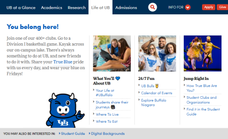
Life at UB menu.
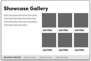
Skeletal view of the Showcase Gallery Navigation Menu Template .
Strong visual impact keyed to each link; e.g. Experiential Learning, Skills for Success.
Best for:
- Complex sites.
- Showcasing opportunities visually.
- Supports "You may also be interested in" links to cross-sell or link to related external services.
Key features:
- Teaser gallery.
This template is created with:
- a Title (H2 heading)
- an Intro Text module (upper left)
- two rows of three Layout Containers
- each Layout Container holds an Image and a Title (H3 heading)
If appropriate, these components may be useful in fine-tuning your presentation:
- A suitable Image can be added below the Intro Text..
- Add a Button below the Intro Text.
Inspirational Examples:
- College of Arts and Sciences Experiential Learning tab
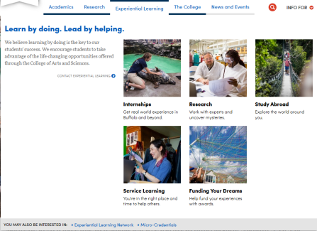
Experiential Learning menu.
This is an application of the Informational Template focused on conversions (e.g. admissions, registration, sales). There is is no actual 'Transactional' template.
Best for:
- Complex sites.
Key features:
- Sets the conversion path and context with a strong call to action (e.g. "Apply Now").
- Supports a sidebar highlight module with rich but focused messaging that can showcase shared content.
- Supports "You may also be interested in" links to cross-sell or link to related external services.
Inspirational Examples:
- UB home page's Admissions tab
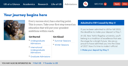
Admissions menu.
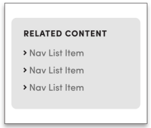
Skeletal view of the Related Content Navigation Menu Template .
These support special link clusters that can provide accessory links for the Basic Menu Template pages. Be very selective and provide intuitive labels.
Best for:
- Standard sites or directories
Key features:
- Can be used on multiple menus.
Supported Components
The following are generally available for use on navigation menu templates, but are not encouraged or permitted everywhere. Please be thoughtful.
- Body Text
- Button
- Callout
- Divider
- Event List
- Flex Module
- Image (similar to Photo)
- Intro Text
- Shared Content Reference (for a Highlight Template module)
Also, the link clusters are built using these two components:
- Navigation Section (container to hold a Navigation List)
- Navigation List (essentially a List Builder)
Best Practices
This advice applies broadly to all the templates unless otherwise noted.
- Only add images that bring strategic value and are stewarded.
- Build for mobile first. This will help greatly with breaks and scannability and prevent a bad experience for a large proportion of our visitors.
- If you display an Event List, make sure calendar headlines are concise so they do not wrap on your menu.
- Use 'You may also be interested in...' sections to cross-sell content from another section or point to relevant external resources but be highly selective to keep them relevant, and provide clear scent of the destination (e.g. 'Visit UB', 'Transfer to UB', 'Register for UBThisSummer').
- Use Resource List headers to identify the audience or focus your topic, then use your link text to provide scent of the associated content; (e.g. "Where We Are" for local and regional details).
- Reinforce Resource Lists with a highly selective Call to Action (e.g. 'Visit UB'). For inspiration, check out Adobe's menus.
- Build the sidebar highlight module in shared content so it can be repurposed in multiple places throughout your site and swapped out periodically to support conversions (e.g. 'first steps to admissions...' or 'apply now'), seasonal activities (e.g. Commencement, Open House, UBThisWinter), or opportunities (e.g. experiential learning). You could also use leverage content from other collections, such as university-wide or authoritative shared content. Using a carousel or list, the modules can even be cycled randomly.
- Integrate Buttons highlighting key tasks at the bottom of menus.
- Be sure they are directly relevant to that menu (e.g. for Admissions use 'Apply'; for About Us, you might have 'Visit').
- Do not overuse or you will reduce their overall effectiveness .
- Limit these to the footer: contact us, intranet, social media buttons, your address or contact details, and add a site map (which is strongly recommended for accessibility reasons)
Additional Advice
More inspiration for what to choose can be found in the Toolkit from the April 21, 2023 DCT Solutions Group.
How do I create the 'You may also be interested in...' section?
This is a standard Navigation Section with a Navigation List, adjusted as follows:
- Add a Navigation Section if needed to the bottom construction area.
- Add a Navigation List within the Navigation Section.
- Open the Content Tree -- keyboard shortcut 't' -- and select the Menu Section.
(You cannot do this easily on the page itself.)- In Properties, set the Title to 'You may also be interested in...'.
- In Set the Style to 'Related List'.
- In Properties, set the Title to 'You may also be interested in...'.
- Change the Navigation List to 'Build List Using- Curated List', and add several appropriate links.
Test as You Refine
Every step of the way, as you build out your header, make sure it works in both desktop and mobile views using the UBCMS' built-in emulator tool. This will help greatly with breaks and scannability
Keep your old header page for two weeks in case you unexpectedly need to revert back quickly.
Stewardship Concerns
You should already have a stewardship plan in place.
- Set up stewardship reminders to review each menu page at least yearly. Ideally assign a subject matter expert who can best manage each section.
- Block out time well in advance to carry out regular assessment of site usage (analytics) and then implement any refinements.
