The Edit Console
Manage your page content using this part of the UBCMS.
The first time you open a page for editing, a popup slideshow provides a tour of key features. You can skip this then view it later--click Help in Page Information ('equalizer' button).
Overview
This is where authors edit each page on their site.
There are several activity areas in this console with icons/links or dropdowns.
Dropdowns are generally unlabeled, so we have provided our own names in quotes in the documentation. Other tools have unlabeled icons, but those generally have a text label that is revealed on hover.
The page can be modified by adding Components and Assets from the Side Panel, uploading/embedding content into the page, or adjusting what is currently shown in the drag & drop interface. Components are modified by selecting them then using the subsequently displayed tool bar. Some text components also support an 'in place editor'.
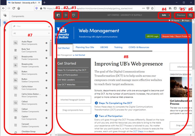
Screenshot of the Edit Console identifying the various activity zones described in this documentation.
Activity Areas
Other Topics
Training
Last reviewed: June 29, 2022
In Flex UI, right-clicking and double-clicking have no special function. Instead, select an item then look for additional options to appear.
There are also many keyboard shortcuts which are usually indicated as tips beside the tools listed in the Command Menu and other toolbars.
1. Toggle Side Panel

Toggle Side Panel icon
Located in the top left of the window.
This tool reveals the Side Panel to the left of the main content area and includes the Assets browser, Components browser, and Content Tree.
> The Side Panel and its elements are discussed in more detail below.
2. Page Information ('equalizer')

'equalizer' icon
Located in the top left of the window.
The Page Information tool (equalizer icon) located in the top left of the window opens a menu that provides Timeline details about the last edit and publication, as well as options including:
- Open Properties
- Start Workflow
- Lock Page - While locked, only you can modify the page and it cannot be published. Only you can unlock it.
- Publish Page
- Unpublish Page
- View as Published - Loads page in preview mode.
- View in Admin - Loads page in Sites console.
- Help
3. Emulator (mobile device simulator)
Located in the top left of the window.

emulator button
This Flex UI tool allows authors to preview and make necessary layout adjustments to a variety of different screen sizes, from common mobile devices to tablets to standard desktop monitors.
Click then choose from the provided devices (e.g. iPhone 8 Plus) to view your page in that screen size. You can also edit the page in this view to see the impact.
4. Edit (mode) dropdown

Edit Tool icon
Located in the top right of the window.
Located at the top right of the window, the Edit tool opens a dropdown allowing youi to choose the page mode. An adjacent Preview tool provides quick access to Preview mode which is needed to follow links or open/close collapsible containers.
- Edit - the mode to use when editing the page content.
- Design - allows you to enable/disable components for use on a page and to configure the design of the component (if the page is based on a static template ).
- Timewarp - allows you to view a page's state at a particular point in time drawing on available saved versions.
5. Preview mode

Preview mode icon
Located in the top right of the window.
Located at the top right of the window, the Preview tool switches the page to Preview mode which is used to view the page as it will be shown on the published environment or to navigate the site in Author using page links or navigation, including the helpful 'Go to source' links to Shared Content references. You cannot follow links or in-site navigation while in regular Edit Mode.
While in Preview Mode, if you hover over any embedded shared content sections, a helper link will appear that will allow you to navigate to the associated shared content page.
6. Annotation tool

Annotations icon
Located in the top right of the window.
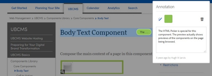
Click to open the Annotation editor, revealing any existing annotations. The icon will display "+" if there are no annotations, or the actual number of annotations currently on the page.
The editor reveals a special view of the page with each Annotation displayed in place.
- Click the "+" in the upper left of the page to add a new annotation.
- Click any of the annotation bubbles to edit its text or color, or to draw additional details (e.g. to circle part of the page or draw an arrow to a particular spot).
An annotation on the page. Click any of the colored, 3-character teasers to display its complete details.
7. Side Panel
Located along the left side of the window.

Toggle Side Panel icon
The Side Panel appears to the left of the main page content when selected from the Toggle Side Panel tool. It provides access to Assets, Components and a Content Tree.
Assets Browser

Assets Browser icon
- Shows all content in the Assets section of the UBCMS (for all sites).
- When the Assets Browser is open you can browse through all the assets available for your page. Infinite scrolling is used to expand the list when required.
- To add an asset to your page, select and drag to the required location.
- From the top toolbar of the assets browser you can filter the assets by Name, Path, Category and Type. (See Best Practices for Filtering, below.)
- Click the little pencil icon to the right of an asset to view or modify its properties in the Asset Editor.
Best Practices for Filtering
The file list is sorted chronologically, by modification date. The most recently modified (or newest additions) are at the top.
- If you know the filename (complete or partial), try searching for that first.
- If not, navigate to your source folder:
- Adjust asset type (default is images, documents includes PDFs). Changing this later will remove your Path!
- Enter the Path by clicking the magnifying glass icon to navigate to your source folder.
- Optionally, adjust Publish status (Published vs Unpublished).
Components Browser

Components Browser icon
- Shows all components that are available for use on your current page.
- These can be dragged to the appropriate location on your page, then edited to add your content.
- Components are represented by name, group (in gray) and the icon or abbreviation (first two charaters of its name).
- You can filter the listed components by name or limit the display to a specific predefined group.
Content Tree

Content Tree icon
- Gives a hierarchical overview of all of the components on the page so you can see at a glance how the page is composed.
- Beside each component name will be additional descriptive text pulled from your page to help identify which element it is.
- Clicking on the component will highlight the component in the page editor.
- If the component you select in the tree is editable, a wrench icon will appear to the right of the name. Clicking on this icon will directly start the edit dialog for the component.
8. Page Content (center well)
Located in the center of the window.
In the center of the window is an editable representation of the selected UBCMS page. Components can be dragged and dropped onto this area from the Side Panel and then further edited in place. Assets can be uploaded into these Components from the Side Panel.
Keyboard Shortcuts
These are Windows/Linux and MAC OS keyboard shortcuts for some commonly-used features, which are also frequently labeled on toolbars and menus (look for tool tips and hovers). For users who do not use keyboard shortcuts or have accessibility needs, some shortcuts can be disabled in My Preferences.
| Shortcut | Function | Action |
|---|---|---|
m | mode | Toggle between Edit and Preview modes. * |
p | properties | Open Properties dialog box. |
c | components | Open/close Component Browser in Side Panel. |
a | assets | Open/close Assets Browser in Side Panel. |
t | tree | Open/close Content Tree in Side Panel. |
/ | annotations | Toggle Annotation mode on/off. |
+ (= key) | collapsible content | Expands/collapses selected container (select by click or hover). |
| Alt + (= key) MAC: Opt + | collapsible content | Expands all containers on page. If all are already expanded, collapses all containers. |
Ctrl click | select | Select multiple components, one by one. |
Shift click | select | Select multiple components, from one to another. |
Ctrl c | copy | Copy selected component(s). |
Ctrl x | cut | Cut selected component(s). |
Ctrl v | paste | Paste selected component(s). |
Ctrl Backspace | delete | Delete selected component(s) |
Ctrl z | undo | Undo last change. |
Ctrl y | redo | Redo last change. |
* If a video is currently activated, 'm' will instead mute the sound.
Printable Version
Download or print these tipsheets of all keyboard shortcuts.
Add Special Characters into Text Components
Use these tricks to insert special characters like emojis, symbols and accents into components that use the Rich Text Editor.

