Transforming UB’s digital communications.
Editing a Page
Using the Edit Console, content is positioned using Component then edited in place.
The first time you open a page for editing, a popup slideshow provides a quick tour of the features. You can skip this tour but turn it back on later from the Page Information menu.
On this page:
Last reviewed: August 27, 2025
Introduction
Open a page for editing by selecting it in the Sites Console, then clicking the Edit button in the top toolbar. The page normally opens in a new browser tab, in the Edit Console.
Once in the Edit Console, page content is built up incrementally using Components added from the Side Panel. Once Components are added, text can be entered manually and assets can be uploaded into the page or drawn in from the shared Assets area. As you make your changes, the UBCMS will display a close expression of what your page will ultimately look like when it is live.
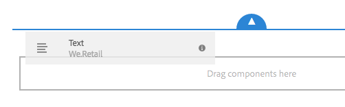
Components are modified by selecting them and then using the subsequently displayed tool bar. Some text components also support an 'in place editor' where you can click into the component and then edit the text directly (e.g. Title or Body Text).
The Side Panel (Assets Browser, Components Browser, Content Tree)


Toggle Side Panel button
The Side Panel is a large sidebar that appears to the left of the main page content when selected from the Toggle Side Panel button. It has drawers that provide access to Assets, Components and the Content Tree.
Assets Browser


Assets Browser icon
- Shows all content in the Assets section of the UBCMS (for all sites).
- When the Assets Browser is open you can browse through all the assets available for your page. Infinite scrolling is used to expand the list when required.
- To add an asset to your page, select and drag to the required location.
- From the top toolbar of the assets browser you can filter the assets by Name, Path, Category and Type. (See Best Practices for Filtering, below.)
- Click the little pencil icon to the right of an asset to view or modify its properties in the Asset Editor.
Best Practices for Filtering
The file list is sorted chronologically, by modification date. The most recently modified (or newest additions) are at the top.
- If you know the filename (complete or partial), try searching for that first.
- If not, navigate to your source folder:
- Adjust asset type (default is images, documents includes PDFs). Changing this later will remove your Path!
- Enter the Path by clicking the magnifying glass icon to navigate to your source folder.
- Optionally, adjust Publish status (Published vs Unpublished).
Digital Assets are managed in another part of the UBCMS using the Assets Console.
Components Browser


Components Browser icon
- Shows all components that are available for use on your current page.
- These can be dragged to the appropriate location on your page, then edited to add your content.
- Components are represented by name, group (in gray) and the icon or abbreviation (first two charaters of its name).
- You can filter the listed components by name or limit the display to a specific predefined group.
Content Tree


Content Tree icon
- Gives a hierarchical overview of all of the components on the page so you can see at a glance how the page is composed.
- Beside each component name will be additional descriptive text pulled from your page to help identify which element it is.
- Clicking on the component will highlight the component in the page editor.
- If the component you select in the tree is editable, a wrench icon will appear to the right of the name. Clicking on this icon will directly start the edit dialog for the component.
Building a Page's Contents
Once in the Edit Console, page content is built up incrementally using Components added from the Component Browser in the Side Panel. Once Components are added, text can be entered manually and assets can be uploaded into the page or drawn in from the shared Assets area. The UBCMS has a WYSWYG interface, so a close expression of what your page will ultimately look like live is continually displayed as you make your changes.
Adding Components to a Page
New component placeholder marker.
Components can be added to the page in two ways. They can be added from the Components Browser in the Side Panel, or they can be added directly from the page.
To add from the Components Browser
- Click the Toggle Side Panel button to open the Side Panel.
- Select the Components Browser drawer.
- Navigate to the desired component, then drag and drop it onto your page.
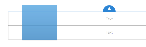
- Dropping it onto any existing component will place it above that component, as indicated by a visual cue.

Component toolbar inbcluding the "+" icon.
To add directly from the page:
- Select a component that lies directly below where you wish the new component to be.
- In the component toolbar, click the "+" button for the Insert Component Tool.
- An alphabetical list will appear of all available components.
- Select the desired component and it will appear on the page.
Modifying Components

Component toolbar including the pencil and wrench icons.
Components are modified by selecting them and then clicking the subsequently displayed tool bar. The pencil icon (when present) provides access to change text, while the wrench icon ('Configure') opens the settings. Hovering over each tool icon will provide the tool's name and any associated keyboard shortcut. Click the checkmark to save any changes.
Rich Text Editor.
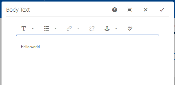
Most text components (except Title) have a Rich Text Editor, a toolbar that provides some basic tools to modify your text, such as bold, italics, bulleting and hyperlinks. Make any changes then click the checkmark to save them.
Some text components such as Title or Body Text also support an 'in place editor' where you click the pencil icon, then edit the text directly. Make any changes then simply click elsewhere on the page to save them, or use the Escape key on your keyboard to cancel. This method allows simple text changes, but no toolbar or formatting tools are provided.
You may also copy some styling from more advanced software like MS Word. Allowable styles (e.g. bold, italics, bulleting, hyperlinks and many special characters) will copy right into the UBCMS while others (e.g. colored font, true headings, or images) will be filtered out. It is also possible to input special characters and emojis by pasting them in, or using keyboard shortcuts.
Tip: If you are having trouble locating or selecting a component, try using the Content Tree in the Side Panel.
This feature provides a list of all the utilized components in the same order they occur on the page. Select any to highlight its location on the page, and access the Configure tool. (Similarly, select any on the page itself to similarly highlight it in the Content Tree.)
Adding Assets to a Component
Images and other digital objects can be added to the page in two ways. They can be uploaded and embedded directly into a component on your page, or they can be added from the Assets Browser in the Side Panel, which results in them being displayed or linked on your page using a reference to their actual source in Assets.
To upload into the component:
- Add a suitable component (Photo, File Download, etc.) and open it for editing by clicking the wrench ('Configure') icon.
- Click the 'browse for a file to upload' link in the component.
- Follow the steps to select and upload the desired asset from your computer.
- Adjust any settings (e.g. Alt Text) and then save your changes.
To add from Digital Assets:
- Add a suitable component (Photo, File Download, etc.) and open it for editing by clicking the wrench ('Configure') icon.
- Click the Toggle Side Panel button to open the Side Panel.
- Select the Assets Browser drawer.
- Navigate to the desired asset, then drag and drop it onto your component.
- Adjust any settings (e.g. Alt Text) and then save your changes.
Copy/Cut/Paste/Move/Delete Components
Modifying Single Components

Component toolbar.
Selecting a component will open the toolbar. This provides access to various actions that can be performed on the component. Actions available to the user will be shown as appropriate to the situation. (Hovering over each tool icon will provide the tool's name and any associated keyboard shortcut.)
To Copy/Cut a component, select it, then the appropriate tool.
To Paste a component into a new location, after copying or cutting it, select the new location (another component) and then click the Paste tool. The component will be placed above that component.
To Delete a component, select it then click the Delete tool. Any associated Annotations will also be deleted.
In Move a component, use the Cut and Paste method (or Copy and Paste).
Component new location placeholder marker.
As an alternative, a component can be relocated on a page by clicking on, then with the mouse still engaged, dragging it to a new location. Placing it on top of another component will relocate it above that component, as indicated by a visual cue.
Containers cannot be copied easily
The standard rules that allow you to copy/paste, or cut/paste components do not apply to containers. They must be handled individually, and you may need to build a new container, and then transfer any components from one to the other. This includes Form Containers, Collapsible Content Containers, Related Content Container, and Content Optimization Containers.
Modifying Multiple Components
It is also possible to select multiple components. These are all comparable:
- Hold the Control key (or MAC Cmd), click each additional component in your preferred order, and then complete the copy/cut/delete action.
- Select the first component, click the 'Group' option that appears on the toolbar, click each additional component in your preferred order, and then complete the copy/cut/delete action.
- Select the first component, hold the Shift key, then click the last component to select all components in between. If you are copying or moving, be careful to select from top to bottom of the page, otherwise the components will be reversed during the process.
Copying Components to Another UBCMS Page
You can copy and paste content from one browser tab to another.
Use the UBCMS Copy and Paste tools for this process.
- Open your source page, and your desired target page in two separate browser tabs.
- Select the component(s) on your source page (browser tab #1).
- Click the Copy tool on the toolbar (don't worry which component's toolbar is displayed).
- Switch to the target page (browser tab #2).
- Select a spot on the target page and click the Paste tool.
- The component(s) should now appear on the source AND target pages.
You can copy multiple components using the Control-click or Group or Shift-click methods. But the process will 'break' if you include a container (e.g. Column Control, Form, or Collapsible Content Container). In that situation, do the process in several steps:
- Select everything up to the container, and paste it to the target page.
- Then for each container, copy each's contents as a group, or for columns, copy each column as a separate group.
- Then select everything after the container and paste that over to the target page.
- Double check it was all copied over cleanly.
Undo/Redo Actions


Undo/Redo buttons
Should you realize you deleted or changed a component by mistake, the built-in Undo/Redo feature may be helpful. Look at the top left of the window for curved arrows. Immediately after you modify a component (edit, copy, cut, paste or delete), the Undo button will appear. After an Undo, the Redo button will also appear. Click the appropriate button and your modification will be changed.
Using Annotations


Annotations button
Annotations provide an on-page editorial or stewardship message to yourself or other authors. They are added, viewed, or modified by switching to the Annotation page view. Look for a small icon at the very top right of the window with a number or a "+" in it. The number indicates how many annotations are currently on the page, or it has a "+" if there are currently none. Click the icon to switch to the Annotation view.
Once in the Annotation view, any annotations on the page will be displayed near the component they refer to, as a colored bubble with the annotation fully displayed.

Page annotations.
To add a new annotation, click the "+" icon in the UPPER LEFT of the window, then click a component to associate it with. A dialog box will open. Add your message and change the color if desired. Then click off to the side of the dialog box to close and save your changes.
Or click an existing annotation to change the text or color.
To delete an annotation, open it for view and click the trash icon. Each annotation is attached to a component, so deleting that component will also delete any attached annotations.
To return to Edit mode, click the "X" in the UPPER RIGHT of the window.
Preview Mode and Following Links


Preview button
Located at the top right of the window, the Preview tool switches the page to Preview mode which is used to view the page as it will be shown on the published environment or to navigate the site in Author using page links or navigation, including the helpful 'Go to source' links to Shared Content references. You cannot follow links or in-site navigation while in regular Edit Mode.
'Go to source' links
While in Preview Mode, if you hover over any embedded shared content sections, a helper link will appear that will allow you to navigate to the assosicated shared content page.
Keyboard Shortcuts
| Shortcut | Function | Action |
|---|---|---|
m | mode | Toggle between Edit and Preview modes. * |
p | properties | Open Properties dialog box. |
c | components | Open/close Component Browser in Side Panel. |
a | assets | Open/close Assets Browser in Side Panel. |
t | tree | Open/close Content Tree in Side Panel. |
/ | annotations | Toggle Annotation mode on/off. |
+ (= key) | collapsible content | Expands/collapses selected container (select by click or hover). |
| Alt + (= key) MAC: Opt + | collapsible content | Expands all containers on page. If all are already expanded, collapses all containers. |
Ctrl click | select | Select multiple components, one by one. |
Shift click | select | Select multiple components, from one to another. |
Ctrl c | copy | Copy selected component(s). |
Ctrl x | cut | Cut selected component(s). |
Ctrl v | paste | Paste selected component(s). |
Ctrl Backspace | delete | Delete selected component(s) |
Ctrl z | undo | Undo last change. |
Ctrl y | redo | Redo last change. |
* If a video is currently activated, 'm' will instead mute the sound.
Emulator (mobile device simulator)
In today's world a page needs to be responsive not matter what the size of the device viewing your page. The UBCMS has Responsive Web Design (RWD) baked into it, but we still need to check that how we use our content on a page works across devices.


emulator button
This Flex UI tool allows authors to preview and make necessary layout adjustments to a variety of different screen sizes, from common mobile devices to tablets to standard desktop monitors.
Click then choose from the provided devices (e.g. iPhone 8 Plus) to view your page in that screen size. You can also edit the page in this view to see the impact.

A UBCMS page as displayed on an iPhone-sized screen.
Choose from the provided devices (e.g. iPhone 8 Plus) and the page will adjust to the new screen size, allowing you to continue to make adjustments to your page content and layout and see their impact.
You may need to use the Content Optimization Container to set specific positions for content in full-size versus small screen devices.
Timewarp


Edit dropdown
Timewarp is a mode of the Edit Console, so it applies to all pages you are editing. Look for the (blue) banner at the top of the window.
This feature simulates the published state of a page at a specified date and time. It uses Versioning, so there must be a saved version of the page that predates the requested date/time.
The mode runs for your entire browser session, so you can navigate to other pages throughout your site (or the entire UBCMS), including deleted pages (provided old versions of those pages are still stored). If no published version is found, Timewarp will revert to the current state of the page in the Author environment to prevent a 404 error that would terminate browsing.
To enter Timewarp mode, click the Edit dropdown in the upper right of the window and select Timewarp. Once you choose a date and time, that version of the page will load. A (blue) banner will appear at the top of the window, to show you are in Timewarp. This banner acts as a toolbar, allowing you to choose a new date and time, or to 'Exit Timewarp.'


Timewarp banner toolbar at the top of the page.
Limitations:
- Timewarp works based on published pages - Timewarp will only work fully if you have previously published the page. If not, timewarp will show the current page in the Author environment.
- Timewarp uses page versions - If you navigate to a page that has been removed/deleted from the UBCMS it will be rendered properly if old versions of the page are still available in the repository.
- Removed versions affect Timewarp - If versions are removed from the repository then Timewarp cannot show the correct view for the rquested date and time.
- Timewarp is read-only - You cannot edit the old version of the page. It is only available for viewing. If you want to revert to the older version you would have to restore pages.
- Timewarp is only based on page content - If elements (such as code, css, assets/images, etc) for rendering the website have changed, the view will differ from what it originally was, as those items are not captured in versions.