Writing and Adding Links
A general introduction to building links and references in the UBCMS.
On this page:
- Additional Label Text setting.
- Beware of duplicate link text.
- Images require Alt text (when they are links).
- Use 'Open in New Window' (or Tab) sparingly.
> Read more.
Last reviewed: March 11, 2025
Tips on Writing Link Text
Writing good link text is an art as well as a science.
- Be Specific: The text should clearly describe where they will land next and why they are being sent there. Vague language like "read more" fails that task; "read more about our application process" would be better.
- Be Sincere: Link text should set an accurate expectation of what is next and fulfill that promise. Do not promise to provide detailed information in a linked resource if that destination barely mentions the topic in question.
- Be Substantial: Links should be labeled so that they stand alone if removed from the context of the page. Avoid slang and acronyms. Do not get too clever or cute with your language.
- Be Succinct: Use clear language for better understanding and ease of scanning. Make your text as short as possible to fulfill all of these goals.
- Multiple links to different destinations should not use the same text.
- Multiple links to the same destination should not use different text. But ideally you should only have one link to each destination on a page.
Adding Links to UBCMS Pages
Links can be added to your UBCMS pages using the settings within many UBCMS components, including text components, Titles, Photos, Buttons, Calls to Action, and lists.
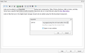
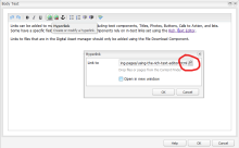
Some of these components have a specific 'Link to' field for the URL, while text components (Body Text, Caption, Intro Text) rely on in-text 'Hyperlinks' set using the Rich Text Editor.
Digital Assets should ONLY be provided using a File Download component.
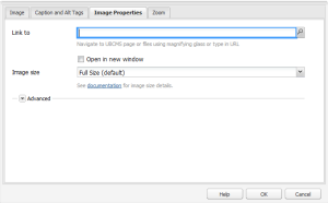
The 'Link to' setting in a Photo component.
'Hyperlink' setting in a Body Text component.
Linking to the Top of the Page
On pages that are long or provide very detailed content (such as FAQs), it may prove useful to provide an easy way for your readers to quickly navigate back to the top of the page.
Link to #skip-to-content
Anywhere you can add a link, such as in text, a Call to Action component, Title, etc., if you type in "#skip-to-content" for the link, it will scroll back to the top of the center column.
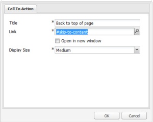
Example of 'back to top' link set in a Call to Action component.
Example in Use
Click the 'Call to Action' link below—the browser will shift to the top of the page. (This will not be as obvious as it would on a long page.)
Linking to Email (mailto's)
Mailto's (links that load an email message) are just like any other link.
Select your text and add a link, but in this case, the link prefix will be "mailto:" (or "mailto://") plus whatever email you wish to use; e.g. "mailto:someone@yoursite.com".
To add a subject line, include an extra parameter of "?subject="; e.g. "mailto:someone@yoursite.com?subject=Mail from Our Site".
The displayed part of the link can of course be anything you prefer.
When a visitor clicks that link, their computer will attempt to load their email client.
Linking to a Phone Number
Many smart phones will automagically recognize phone numbers and try to call the displayed number, but to make a phone number fully clickable, try tel:+ plus the full phone number. Generally we suggest not to include any hyphens or parentheses. E.g. tel:+7166456969 is University Communication's main number. When a visitor clicks that link, their computer will attempt to load their phone client. The displayed part of the link can of course be anything you prefer.
Linking to a Highlighted Section of a Page
A link can load a page with a section of text highlighted to draw the viewer's attention to that information. This will be easier for external links, or absolute URLs (with the initial https:// prefix).
Some browsers provide a shortcut tool for this task; e.g. in Chrome, right click + Copy link to highlight or for more control and a shorter URL, you can build this out manually.
Add #:~:text= to the end of the link URL, then the text you wish to highlight. Since URLs cannot contain spaces, substitute %20 for each space; e.g. "the text you wish to highlight" would become "the%20text%20you%20wish%20to%20highlight" (without the quotes).
In addition to spaces, you will also need to replace these other characters:
- : (use %23)
- # (use %2F)
- ? (use %3A)
- / (use %3F)
- \ (use %5C)
- % (use %25)
For a longer passage, you can simply provide the first word then a comma and the last word with no spaces, e.g. "the,highlight". Just be careful you do not accidentally target multiple passages.
Your final link might look like this:
https://ubcms.buffalo.edu/help/ubcms-basics/creating-and-editing-pages/linking.html#:~:text=the%20text%20you%20wish%20to%20highlight
Just be aware that performance may vary depending on the browser or local settings, but the target page itself should always load.
Open in New Window or Tab Setting (Target)
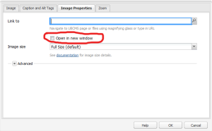
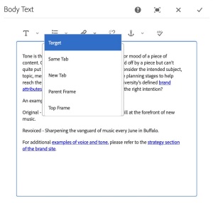
Most 'link to' and hyperlink settings in UBCMS components have an optional companion setting that specifies where the linked page will load. Sometimes this is a 'Target' dropdown and for other components it is a simple 'Open in new window' checkbox.
'Target' supports several settings:
- Same Tab - The link will load in the current browser tab or within the current frame/iframe if one exists. This is the default setting.
- New Tab - The link will load in a new browser tab.
- Parent Frame – The link will load within the parent iframe if one exists, otherwise it will load in the current browser tab.
- Top Frame – The link will ignore all frames/iframes and load in the current browser tab.
'Open in new window' means to open in a new tab of the current browser.
When 'open in new tab' or 'window' is selected, an additional icon will follow the linked text on your published page, to alert visitors they are about to be taken to a new browser tab, and possibly leave the current website.
Note: For accessibility reasons, be careful about sending your visitor to a new tab. This behavior may be unexpected and disorienting. (> Learn more about link accessibility.)
The 'Open in new page' setting in a Photo component.
The link target setting in a Body Text component.
Linking to Other UBCMS Pages
For links to other UBCMS pags, use a relative URL, without the http:// prefix. These URLs will normally begin '/content/www/your-site/...' or '/content/your-school/...' for decanal areas). We suggest you always use the magnifying glass picker tool to ensure you choose the correct page and capture the URL correctly.
'Hyperlink' setting in the Rich Text Editor of a Body Text component, highlighting the magnifying glass picker tool.
Except for lists and slide decks, links to unpublished or nonexistant UBCMS pages will be broken on your live site and will generate a 404 error ('no such page'). > Read more about this Known Issue: Links to Unpublished Pages Can Be Broken on Live Sites
Linking to Anchors Within UBCMS Pages and Components
It is possible to link to a specific section within a Web page, using an 'anchor', basically a named target within a compnent on that page. If you examine the URL, you will see it is immediately followed by a hash plus a keyword; e.g. 'http://www.buffalo.edu/president.html#abcde' (where 'abcde' is the anchor).
When a page is linked in this manner, the browser should automatically load the page down to that section.
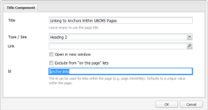
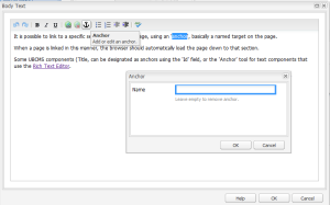
A number of UBCMS components can hold anchors. Titles can be designated as anchors using the 'Id' field, while text components (Body Text, Caption, Intro Text) use the 'Anchor' tool in the Rich Text Editor. Tabs and the Collapsible Content Container can also hold anchors, and will then load with their content displayed.
'Id' setting in a Title component.
'Anchor' setting in a Body Text component.
- To link to a Collapsible Content Container, you must first set an ID in its properties, which becomes an anchor. You can now build a direct link to that container, as hashtag + the ID, and when the page loads, it will display the container in its expanded mode.
For example, each of the following links will load the examples at the top right of the page in expanded mode:- reveal example 1
- http://ubcms.buffalo.edu/content/www/cmshelp/help/components-library/more/collapsible-content.html#1
- in Author: /content/www/cmshelp/help/components-library/more/collapsible-content.html#1
- reveal example 2
- http://ubcms.buffalo.edu/content/www/cmshelp/help/components-library/more/collapsible-content.html#2
- in Author: /content/www/cmshelp/help/components-library/more/collapsible-content.html#2
- reveal example 3
- http://ubcms.buffalo.edu/content/www/cmshelp/help/components-library/more/collapsible-content.html#3
- in Author: /content/www/cmshelp/help/components-library/more/collapsible-content.html#3
- reveal example 1
- To link to an expanded container ON THE SAME PAGE, just use #ID as the relative URL in the link.
For example, this links to the second example, expanded: - You can also link to an anchor INSIDE a collapsible container, and the page will correspondingly load at that anchor, with the container expanded.
This loads the first example expanded, at the location of the subheading which is ID'd as 'sub-head.'- http://ubcms.buffalo.edu/content/www/cmshelp/help/components-library/more/collapsible-content.html#subhead
- in author: /content/demo/components/content/collapsible.html#subhead
You can link directly to any of the slides in a Collapsible Grid, so that the page loads with that slide's content displayed. The slides are numbered, 1, 2, 3, etc. and these become the anchors for your link. Add a hashtag (#) + the slide number to the end of the URL.
For example, this would load the page with the third slide revealed on this Demo Site page:
- http://ubcms.buffalo.edu/content/demo/components/shared/collapsible-grid.html#3
- the corresponding URL in Author would be /content/demo/components/shared/collapsible-grid.html#3
To link to a tab in a Tabs component, click the tab in question and copy the URL that is displayed in the browser location bar. The main tab always loads by default, and shares the same URL as the actual page, but the other tabs insert their name into the page name of the URL.
For example, the tabs of the example on the demo site example will display as follows:
- default tab: 'Custom Title'
- https://ubcms.buffalo.edu/content/demo/components/shared/tabs.html
- in Author: /content/demo/components/shared/tabs.html
- Yes, this is the default URL of the page itself.
- second tab: 'Host Demo'
- https://ubcms.buffalo.edu/content/demo/components/shared/tabs.hosted-demo.html
- in Author: /content/demo/components/shared/tabs.hosted-demo.html
- Note the addition of "..hosted-demo" in the page name, "tabs..hosted-demo.html."
- third tab: 'Collapsible Content'
- https://ubcms.buffalo.edu/content/demo/components/shared/tabs.collapsible-content.html
- in Author: /content/demo/components/shared/tabs.collapsible-content.html
- Note the addition of ".collapsible-content" in the page name, "tabs..collapsible-content.html."
- fourth tab: 'On This Page'
- https://ubcms.buffalo.edu/content/demo/components/shared/tabs.on-this-page.html
- in Author: /content/demo/components/shared/tabs.on-this-page.html
- Note the addition of ".on-this-page" in the page name, "tabs.on-this-page.html."
Linking to External Websites
For links to external websites (pages on other websites, even if they are also within the UBCMS), always include the prefix (usually http:// or https:// for secure pages).
Broken Links
Example of the error message for a broken link in a list.
The UBCMS provides some built-in link checking for automated components (e.g. Lists) that have relative links to other UBCMS pages, but not for external links, and does not do validation for links for links in text components (Body Text, Caption, Title, etc). Links to unpublished or nonexistent UBCMS pages will generate a 404 error ('no such page').
For Lists with broken UBCMS links, the UBCMS will flag a bad internal UBCMS link with a red error message that only shows in Author. This warning will not appear on your published page.
We strongly encourage you to be very careful when building out your links, and when moving or deleteing pages to ensure you do not accidentally create broken links.
The Outbound Link Report can also help you to manage your links in general. This displays everything your UBCMS pages link to, including other UBCMS pages, downloads, images, lists and external links.
Also, SiteImprove provides link checking as one of its services.
Accessibility Concerns
This setting (e.g. in Call to Action and Button components) assists screen readers by giving more context for links with repetitive occurrence on the page. That is, if you have a page with several identically labeled links (e.g. ‘email’ links in a series of employee profiles, where brevity and repetition are desirable), the screen reader will apply the additional text to clarify the difference between these otherwise identically labelled links.
Best practice: decide on a consistent pattern that is easy for multiple people to reproduce and curate over time.
Additional Reference:
To avoid confusion, every unique link on a page must have unique link text. It is not hard to compose comprehensive text for manually coded links, but links that are generated automatically by lists and carousels must also be different, which takes more planning.
Also consider Call to Action, Button, and Tabs components, as well as the pagination and "see all" links in the Event and News List components which may have the same labels and appear more than once on a page. (Some of these have additional label settings that can help prevent this redundancy.)
Best practice: when creating shared content pages that will be used in lists, use distinct titles, or set the Navigation Title in the page Properties so none of your pages have the same title if they are displayed together. Also take advantage of additional label settings in other components when you will have several on a page.
Additional Reference:
Alternative text ('alt text') is a short, written description that describes the appearance, content and/or function of an image on a webpage. Adding alt text is a best practice for all your UBCMS images and is required for accessibility so users will understand what they are not seeing.
Alt text is required in these contexts:
- If the image is a link. *
- If the image is zoomable.
- If the image depicts important information not clearly provided in a caption or other text on the page.
- If the image has a function; e.g. for navigation -- 'next slide'. *
- For a static thumbnail image that are generated by Video and Flex Module components.
* When the image is a link, starts an animation or video, or is a navigational element, alt text should indicate its function, not the image's content (i.e., "watch video ABC" and not "screenshot from video ABC"). Screen readers will treat this image as a standard link.
Purely decorative images (those that do not convey content or have a function on the page as listed above) can instead be set as "This image does not require Alt text" in some components. If the component does not have that setting, you will still need to supply Alt text.
Alt text should be added to images in Assets. This is required for images that are then used in the Photo Gallery component, while it can also be used as an alternate source for Alt text in some components (e.g. the Photo setting 'Get Alt text from Assets').
Best practice:
- Screen readers automatically announce "image of...", so do not include that in your alt text.
- Add a final period so screen readers will pause before reading the rest of the page.
- Be concise (under 150 characters) but include any significant elements to the image.
- Avoid technical language, jargon, and abbreviations.
- Only mention personal identity when relevant to the page (name, age, race, ethnicity, gender, religion, or cultural identifiers).
- If the image is used for navigation, describe what will happen, e.g. "next page of results".
- If the image is a link to another page, name or describe the target page (e.g., "School of Nursing.") but do not say it is a link -- screen readers indicate that as well. This also applies to zoomable Photos.
- If the image is a link that starts a video (named ABC), consider "YouTube video entitled ABC." or just "watch ABC."
- If the image contains a lot of text (e.g. a chart or table), provide this information in other ways on your page, perhaps as a nearby collapsible container labeled appropriately.
- Alt text should be added whenever images are uploaded into Assets, in case the image is later used in a way you did not originally expect.
Text Over Photo provides an accessible alternative to using images that have embedded text.
> Learn more about the Text Over Photo component.
Known Issues
Additional Reference:
Links in many components can be set to open in a new browser window (or tab). The user can thus explore the new page, while preserving the source page (and your website) in the original tab. However, this can be confusing if the user does not realize a new tab has opened. They may become lost, confused how they arrived on that new page and unable to return to your site.
Best practice: let the user control their experience and stay in the same tab, with two notable exceptions:
- Use the 'open in new window' setting if loading a new page in the current window would disrupt their current activity (e.g. moving them to a new page while they are in the middle of completing a form).
- Use the 'open in new window' setting if loading a new page in the current window will break them out of a secure environment.
